IMPERFECT FOODS
Imperfect Foods is an online grocer specializing in reducing food waste and providing affordable fresh produce. I designed a nutrition tracker feature that fits into their online shopping experience.
As consumers we rely heavily on food providers to inform us what's in their products and I believe there's significant room for improvement in this area.
As consumers we rely heavily on food providers to inform us what's in their products and I believe there's significant room for improvement in this area.
BACKGROUND
Problem
Nutrition trackers are a proven, powerful tool in helping users manage their weight and creating better dietary habits, but they have one major flaw. The time and effort spent entering food drives down usage and consequently their success.
Solution
Online grocers already have a record of the food we purchase so I designed a feature that takes that data and gives it back to the customer.
I've worked in health and fitness for 10+ years and while auditing the UX of the Imperfect foods website for a study exercise I was struck with this idea. I decided to turn the idea into one of my capstone projects and put together this prototype as a step towards validating the concept.
Objective
Create and test a MVP for the new nutrition tracker. The feature consisted primarily of three screens.
A simple but impactful dashboard that informs users about their dietary history on the platform, educates them on the impact of their decisions, offers up useful recommendations, and allows users the ability to customize their own goals.

SCREEN 1
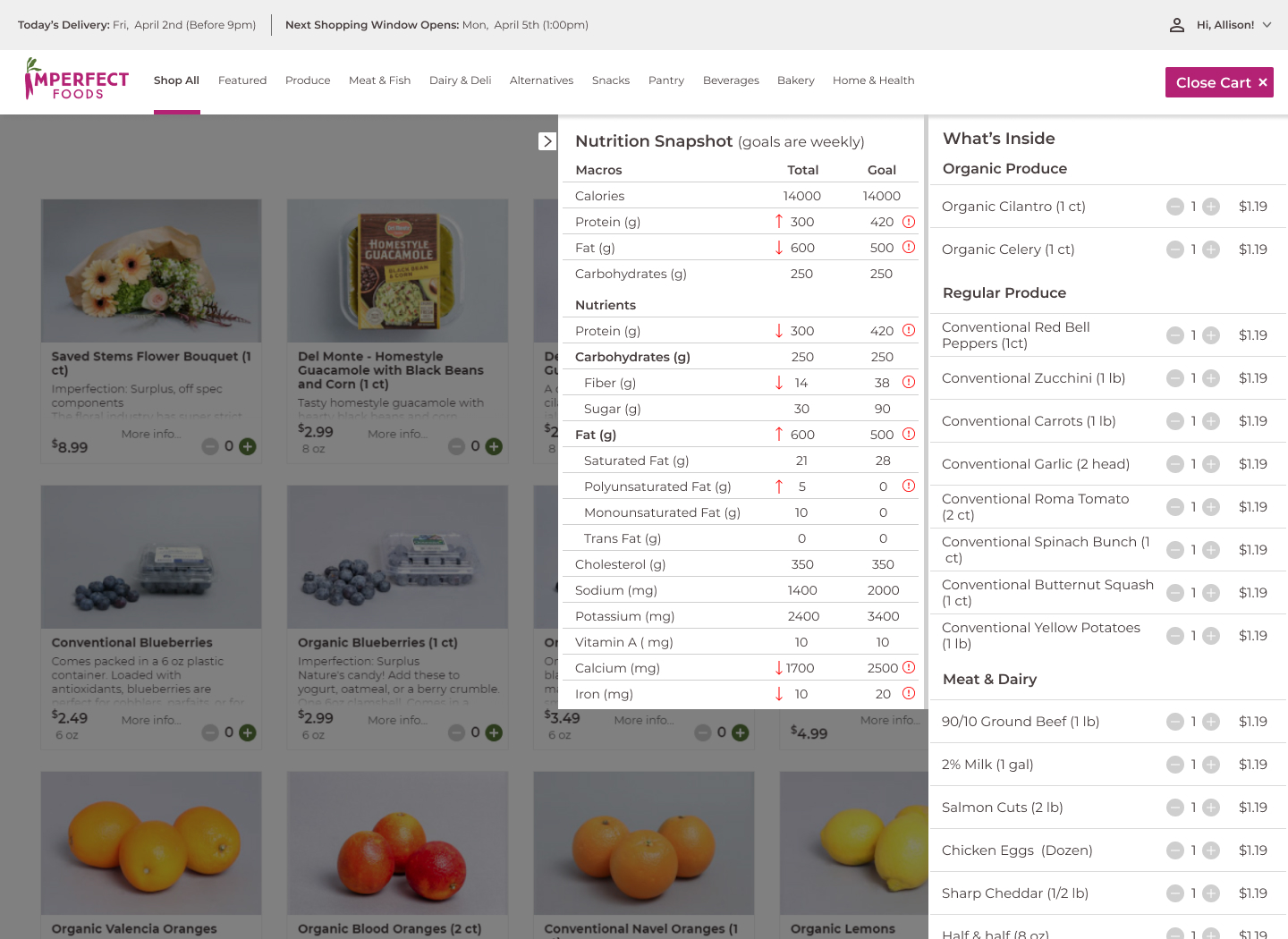
A customizable weekly nutrition report.
This is a view of the shoppers' cart that now shows a quick nutrition breakdown of everything they're ordering for the week in relationship to their dietary needs. Forgot to add enough protein to your cart? This will tell you quickly.

SCREEN 2
An expanded cart view to include a nutrition summary.
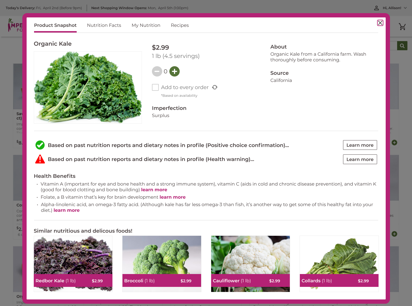
I expanded the existing product details view to provide useful information in the users Nutrition Report while they're shopping. This view includes links to more information, similar foods, recommendations, warnings, positive feedback, and detailed Nutrition Facts found on the nav-bar inside the modal.

SCREEN 3
An expanded product details modal.
This project was loaded with research. I started by identifying the two questions I needed answered first and then selected my methods from there.
Special consideration for this part of the process was given to avoiding personal biases from my experience in this area.
Special consideration for this part of the process was given to avoiding personal biases from my experience in this area.
1. RESEARCH
- User Observations
- Site Audits
- Secondary Research
- User Interviews
- Rapid Prototype Testing
- Competitor Analyses
- Site Audits
- Secondary Research
- User Interviews
- Rapid Prototype Testing
- Competitor Analyses
QUESTIONS
METHODS
EFFECTIVE
Both primary and secondary research were in support of nutrition tracking to be an effective form of managing your diet. Research also indicated no need for extreme tracking. The main goal is eliciting a pattern of better eating habits.
MOTIVATING
Primary research showed that nutrition tracker users used them to kick start healthy eating habits, but they eventually moved on from using them for one reason or another.
1. I needed to know how and why nutrition trackers work and fail.
2. I needed to know what makes an effective tracker from the user's perspective.
2. I needed to know what makes an effective tracker from the user's perspective.
RESEARCH INSIGHTS
TIME CONSUMING
The greatest barrier to using nutrition trackers is the amount of time it takes.
The defining stage resolved around three key ingredients I wanted to build the feature around. These keys were uncovered through use of a building a user persona. I then used these ingredients to build my user/task flows and then a feature list.
2. DEFINE
CONVENIENT
Life is busy and as much as people largely say they want to be healthy, it takes time and work. This is a barrier many people are unable to overcome, even if this is sometimes somewhat of an imaginary barrier (excuse).
EDUCATIONAL
Education is simply one of the most powerful tools in creating healthy eating habits.
FLEXIBLE
No two people are the same and similarly dietary needs and psychological motivations vary from person to person. Knowledge levels among individuals also varies.
OBJECTIVES
USER PERSONA
Adding a feature into an existing product meant not having to spend time on design features such as fonts and buttons but came with another challenge, where to position the new feature inside the existing product.
Did it deserve it's own page? How would it impact users' flow when shopping? These were just a couple questions I had to keep in mind.
I put together a set of hi-fidelity wireframes and began testing.
Did it deserve it's own page? How would it impact users' flow when shopping? These were just a couple questions I had to keep in mind.
I put together a set of hi-fidelity wireframes and began testing.
3. DESIGN
User interviews were conducted using the three primary screens seen in the wireframes above. Participants were shown the screens and introduced to the product before being interviewed to gain insight on how they felt about the new feature. The data was analyzed through use of an affinity map.
4. TESTING
KEY TAKEAWAYS
VALIDATION
Comments across the interviews validated pushing this idea further.
SUGGESTIONS
Everyone appreciated the amount of educational information available but feedback was that it felt like a lot of text.
POSITIVE FEEDBACK
Testers felt like the appropriate information was presented and was presented in digestible and recognizable ways.
This was the single most important takeaway from this entire project and it's challenge moving forward.
The challenge is how to make sure there is enough information to encourage food education and illicit healthy dietary changes without scaring people away with too much info.
The food and diet industry is notorious for making blanket statements leading to unhealthy fads and unbalanced diets. A pitfall I hope this feature can avoid and will be the focus moving forward.
FINAL THOUGHTS
This speculative feature to my knowledge doesn't exist, but I believe can and should. It was successfully validated through research and testing, but requires a lot more time for research, testing, and refining.
I believe that this idea executed properly could move the food industry and our society to a healthier future. Transparency, education, and convenience combine to make it a powerful tool.
A feature like this would come with a lot of "technical" considerations I leapt over, but am fully aware of. Considerations such as potentially providing medical/health advice, the AI support to do so, and data privacy just to name a few.
I designed it with an Imperfect Foods skin, but this could be part of any online grocery shopping experience.
.png)

